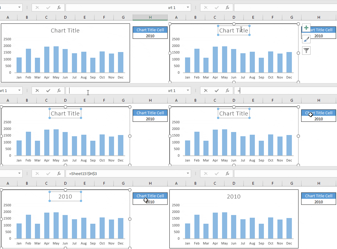
Creating dynamic chart titles in Excel elevates the visual impact and the utility of our charts significantly. Whenever the data changes, especially with yearly updates, having an Excel chart that adjusts not only its data points but also its title ensures consistent accuracy. It’s a relief knowing you can avoid the hassle of manually updating the chart title, reducing the risk of errors.
I’ve realized the importance of context and clarity while presenting data, and a descriptive title is crucial for any reader to understand the chart at a glance. Dynamic chart titles offer just that. By linking a chart title to a cell within the spreadsheet, updates become seamless and automatic. It’s like setting the stage for your data to shine without you having to constantly manage the spotlight.
Steps to Create Dynamic Chart Title in Excel
To keep your Excel charts updated, follow these steps:
- I click on the chart title to select it.
- I type
=in the formula bar. - Next, I click the cell that’ll be my chart title.
- Pressing Enter, the chart title now dynamically changes with the cell’s content.

Check out these cool charts: Advanced Excel Charts with Free Templates
Combine Cell Links and Text to Create a Dynamic Chart Title
To effortlessly update a chart title with varying data, I use a combo of cell references and text. Here’s a quick rundown:
-
Edit a new worksheet cell with:
="Monthly Sales Trend: " & H3
This merges the text with the cell’s content. -
Click on the chart title, hit
=in the formula bar, then select the newly crafted cell. -
Confirm by pressing Enter.
Now, any changes in H3 reflect in the chart title, keeping it dynamically updated. Oh, and don’t miss out on visualizing the process here.
Creating Dynamic Title in Pivot Chart
I discovered an easy way to add a dash of interactivity to my pivot charts. Here’s my quick guide:
- Prepare Your Pivot Chart: First step’s to create a pivot chart, necessary groundwork for a dynamic flair.
- Link Title to Data: Like magic, clicking the chart title and typing
=in the formula bar lets me select the cell driving my title. - Watch It Update: As I fiddle with the data or sales filters, my title keeps up, adapting to reflect the analysis.

Create a Dynamic Chart Title with Shapes
I often use a neat trick to keep my charts clean while retaining dynamic titles. Here’s my go-to method:
- Insert a rectangle shape into my worksheet.
- In the Formula Bar, link the shape to a cell, the same way I’d link a standard chart title.
- Adjust formatting options as needed to tailor the visual presentation.
Check out this example:

I can put this shape over my chart or wherever space permits. It’s a handy workaround and keeps my workspace looking sharp!
Important Points
- Formatting: Customize chart elements like axis titles to match my preferred font style.
- Size & Color: Adjust the font size and color for clarity.
- Linking: I can tie my chart title to a cell with a formula for dynamic updates.
- Line Breaks: To add a line break in the title, I just do it in the linked cell.
- Customization: Personalize axis titles for better data representation.
Sample File
- My example: Dynamic Chart Title
Conclusion
In crafting dynamic charts, linking the chart title to a cell with a fo formula creates a responsive and interactive element in presentations. It allows for real-time updates and reflects changes instantly, making the data more accessible and engaging.
I’ve found this approach incredibly useful, especially when dealing with variable datasets that can shift with user inputs or over time.
Here’s a quick rundown of the process:
- Link your chart title to a cell.
- Use a formula in that cell to ensure the title updates automatically.
If you’ve tried this method or have any thoughts on it, drop a comment below. Sharing handy tips like this can help us all get better at presenting our data more effectively! And if you found this trick helpful, pass it on!
More Charting Tips and Tutorials
When I look to jazz up my data presentation, I often add some flair to my Excel charts.
- If I’m aiming to pinpoint specific data, horizontal or vertical lines can be added for reference. For details, the guide here and here break it down pretty well.
Meanwhile, bullet charts pack a punch by showing progress against a target. They’re less cluttered than gauges but still visually impactful. I discovered a straightforward tutorial on that right here.
When I need my charts to react to changing data, I make my chart ranges dynamic, which saves me from constantly updating the range. This technique is a game-changer and can be learned here.
Visualizing sales data? A sales funnel chart does the trick and it’s simple to create with instructions found here.
- Column and bar charts are staples, but I never stop there. Here’s a fun fact: You can turn simple charts into a heat map with conditional formatting. I learned that here.
If you’re like me and always up for trying something new, check out these resources:
Remember, sprucing up your reports with these visuals can make your data storytelling much more compelling.
