In Excel, when I’m crunching numbers and datasets, making the data easy to digest is a top priority. That’s where charts come into play, transforming raw figures into visual stories. I’m especially drawn to unique charts that bring out specific details in the data—like the speedometer chart, a nifty gauge that isn’t just for measuring velocity in vehicles. It’s a chart I see pop up now and again, especially useful for vividly showcasing performance measures or progress towards a goal.
As much as I appreciate a well-constructed Excel dashboard, I’m aware there’s some debate about the use of speedometer charts. Some find them pretty handy, while others are skeptical about their effectiveness. Nevertheless, I’ve decided to dive into the hows of creating this contentious chart. The goal is to arm you with enough insight to decide when to integrate it into your own spreadsheet adventures.
What is an Excel SPEEDOMETER Chart?
A SPEEDOMETER Chart in Excel is a visual tool that mimics a car’s speedometer. It’s useful for showing where a single value falls within a defined range. Think of it as a cool, easy-to-read gauge. Here’s what makes it stand out:
- Combines doughnut and pie charts to create the gauge effect.
- Represents data visually, like speedometers in vehicles.
- Helps in tracking a data point against its target with a dynamic “needle”.
And below, behold a sleek example:

They’re not just helpful; they make data look pretty neat, too.
Steps to Create a SPEEDOMETER in Excel
To craft a SPEEDOMETER chart in Excel, which showcases data like a gauge dial, follow these steps:
Prepare Your Dataset
Before starting, organize your data into three tables:
- Category Range table: This determines performance levels.
- Label Range table: Defaults to 0-100 but can modify as needed.
- Needle Value table: Contains the real value you’re tracking.
Begin with a Doughnut Chart
Inserting a doughnut chart is the first step:
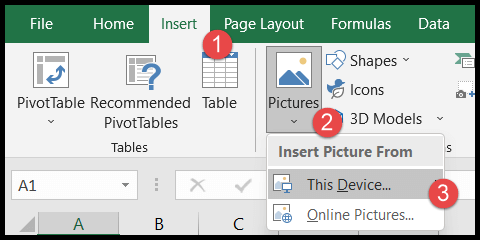
- Head to the Insert Tab > Charts > Doughnut Chart to get a blank chart.

Select the Proper Data
Right-click the chart for the “Select Data” option. Click on “Legend Entries,” name it “Category,” and choose the “Value” from the first table for your data range.

Adjust the Chart’s Angle
Fine-tuning the doughnut chart’s angle gives it the speedometer look:
- Via “Format Data Series,” set the “Angle of first slice” to 270° to rotate your chart.
Hide Half of the Doughnut
By right-clicking, access “Format Data Point” and apply “No Fill” to the bottom half, shaping it into a semi-circle. Select differing colors for each data point for visual contrast.
Insert the Second Doughnut for Labels
Repeating the process, utilize the second data table for labels:
- Right-click, “Select Data,” and add a new “Legend Entry.” Choose values from the second table.
Slice Visibility
Like before, hide half of the slices and add a color scheme to the remaining labels for clarity.
Add the Pie Chart for the Needle
The pie chart acts as the needle or pointer:
- Right-click once more, “Select Data,” and incorporate new “Legend Entries” using values from the third table.
Once set up, the pie chart will overlay onto the doughnut charts, visually indicating the value. The pie chart’s sole visible slice serves as the needle that moves to display the current value.
Final Touches
Adjustments to the “Doughnut Hole Size,” alignment on the “Secondary Axis,” and intervals add the finishing touches to your speedometer. For seamless integration, ensure the pie chart (the needle) complements the underlying doughnut charts in terms of size and orientation.
Remember, the chart can be dynamic! By linking the needle to a dataset cell, the needle moves as your data changes. Just right-click the needle, select “Format Data Point,” and connect it to your dataset.
You can also nest a “Text Box” in the center of the doughnut charts for a “Chart Title” or additional information. To do this, simply select “Text Box” from the “Insert” tab and position it accordingly.
Tweak the Design
Tailor the colors to your preference or utilize “Conditional Formatting” for dynamic color shifts that reflect performance levels.
My Excel dashboard often includes speedometer charts because they’re a visually engaging way to present data ranges and highlight key metrics at a glance.
Once you grasp the basics, which I’ve just laid out for you, you can modify and adapt each element—from needle to color scheme—to fit your unique presentation needs.
And there you have it, your very own SPEEDOMETER chart in Excel, ideal for reports or dashboards where you need a quick, clear visual representation of performance or progress.
Wondering where you can grab these data tables to get started? Download the Excel template here and jump right into building your SPEEDOMETER chart!
SPEEDOMETER – Why and Why Not
1. Single Data Point Tracking
When I’m focusing on a specific KPI, like Customer Satisfaction Rate, I find the SPEEDOMETER useful because it highlights that singular piece of data effectively. It’s at its best when displaying metrics like:
- Performance levels for a sales team member
- Progress towards a project milestone
However, when dealing with multiple data points such as overall sales or production volumes, it doesn’t give the full picture.
2. Only Current Period Data
I’ve noticed SPEEDOMETERS work well in dashboards when I need to showcase current period data clearly, like the latest customer satisfaction rates. But, it falls short in these areas:
- Tracking historical performance trends over time
- Comparing performance against past sales targets or goals
It’s best for a snapshot of now, rather than a history lesson.
3. Easy to Understand but Time-Consuming While Creating
For me, the simplicity of a SPEEDOMETER chart makes it a win for easy understanding — almost anyone can grasp its message quickly. Yet, there’s a trade-off in the time it takes to set it up, given it’s not a standard option in Excel. For a quick tutorial, I’d grab the sample file to help get through the setup process: download this sample file from here.
Despite the effort, once it’s there, it’s a clear visual marker of whether I’m nailing those KPIs or if I need to put my foot on the pedal.
Conclusion
In my experience, the SPEEDOMETER chart really jazzes up finance or project management reports. I’ve found it valuable for visualizing key performance indicators (KPIs) and capturing insights at a glance. Whether or not everyone’s a fan, it has its place in the right context, don’t you think?
For anyone looking to download a robust template or add-in for crafting these dynamic visuals, there are quite a few tutorials out there that simplify this process. Below is a snapshot of resources I’d recommend for anyone ready to give their dashboards an edge:
- Templates & Bundles: Handy for beginners to get a quick start.
- Tutorials: Great for learning the ins and outs.
- Add-Ins: These can offer advanced functionality for seasoned pros.
Regardless of your stance on their aesthetic value, there’s no denying that these charts can offer clear insights—a win for any dashboard!
I’m all ears for your take on the SPEEDOMETER chart—have you tried it out for yourself? And if you’ve got a moment, pass this tip along. Your pals might thank you for it!


