Excel can be an incredibly powerful tool for visualizing demographic distributions, and one handy chart for showcasing this is the population pyramid. Designed to present the population of both genders across age groups, it’s fascinating to see how a simple bar chart can transform this data into a clear, pyramid-shaped graphic that highlights population growth and structure.
I’ve recently come across a few methods to create these informative charts in Excel, aside from the usual technique most people use. It’s pretty cool to think that with just a bit of creativity and customization, you can put a fresh twist on presenting data. In fact, I’m excited to share some of these unique approaches that can really make your population pyramid stand out.
Simple Steps to Create a Population Pyramid Chart Using Bar Chart
Alright, let’s dive right into the details of crafting a population pyramid chart in Excel. Trust me, it’s not as difficult as it sounds, and once you get the hang of it, you’ll be able to whip up these charts in no time!
My first move is to select the necessary data. I make sure I have age groups listed with corresponding male and female populations. Remember, the female population figures should be entered as negative numbers to differentiate them from the males on the chart. After highlighting the age and gender data, I find my way to the Insert Tab, pick out Charts, opt for a 2D Bar, and insert a Clustered Bar chart.
Now, here comes the exciting part—I transform this standard bar chart into a population pyramid. To kick things off, I reverse the vertical axis order. With a few clicks in Format Axis, I ensure that the chart shows my age groups starting from oldest at the top to the youngest at the bottom. Next up is adjusting the x-axis labels to appear at the bottom by setting the label position to “Low.”
Customization is key, so I then adjust the series overlap to 100% and dial the gap width down to 0%. This step makes sure that the bars for males and females sit snug against the vertical axis with no gaps, giving me that distinctive pyramid look.
My final touch involves tidying up those data labels. I need the female population numbers to be readable as positives, not negatives. Selecting the data labels, I tweak their formatting to display positives for both, which brings much-needed clarity to my chart.
And just like that, my population pyramid chart is ready to go! It beautifully displays the age and gender distribution within the population, with clear differentiation between the male and female populations. Every time I do this, it feels like I’ve added a cool, analytical edge to my data with that neatly laid out graphical representation.
Use Conditional Formatting to Simply Create a Pyramid Chart in Excel
I love making my data visualizations stand out, and nothing does the job quite like a well-crafted pyramid chart. Luckily, Excel’s got us covered with conditional formatting, which simplifies this process immensely. Here’s how I nail it every time:
-
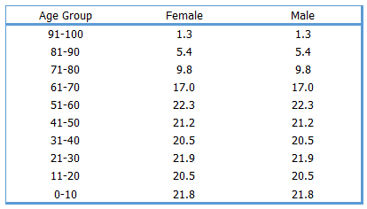
I start off by setting up a table with my male and female population data across different age groups. Helpful visuals are always great, so I include images like
 .
. -
Next step is selecting one of the columns, let’s say female data, and heading over to Home Tab ➜ Styles ➜ Data Bars ➜ More Rules to slap on some nice conditional formatting data bars.
-
I make sure to tick ‘Show Bar Only‘, add a solid border for that sleek look, and reverse the bar direction to differentiate the gents from the ladies. Here’s a snapshot of that setting:
 .
. -
Applying the same magic to the male column, a beautifully symmetric pyramid chart starts to form, such as this one:
 .
. -
For the cherry on top, I add a couple of columns on the flanks to insert data labels, because what’s data without clarity?
Bang! I get a visually appealing pyramid chart that’s both informative and pleasing to the eye. And if I want to get fancy, playing around with the font style and color brings that extra zing to my final presentation. Check out the final masterpiece:  .
.
Create an In-Cell Population Pyramid Chart in Excel
Setting up a simple population pyramid using the REPT function in Excel is straightforward. Here’s the process I follow:
- Start with a table for age groups and gender distribution.
- In the female column, add the formula
=IFERROR(REPT("|",C5*4),"")and fill down. - Similarly, enter
=IFERROR(REPT("|",F5*4),"")in the male column and drag down. - Change font to either Playbill or Stencil, size 10, which works well for visualizing data bars.
- Customize the font color for both columns for visual distinction.
- Adjust the alignment: right for the female column and left for the males, creating a mirrored effect.
- Take care to ensure there is a clear black border defining each cell.
- Remove grid lines for a cleaner look.
The beauty of this method lies in its simplicity; no need for complex chart axes or dealing with negative values. The REPT function, by repeating the “|” character, builds out bars that represent population counts per gender directly within cells. Customization options like font, color, and alignment bring clarity and visual appeal to the data.
Sample File
-
Dataset:
- Demographic data
- Government census reports
- Surveys
-
Analysis Tools:
- Demographic analysis
- Reliable sources
-
Download:
Conclusion
In dissecting population trends, I find that unraveling migration patterns, scrutinizing birth rates, or scrutinizing the workforce requires more than just raw data. The interpretation is key. I lean on pyramid charts for a clear visual comparison and trend analysis. They are not just about plotting population statistics; I see them applied in business sales reports, revealing patterns year over year.
My spreadsheet often includes a neat pyramid, especially when shedding light on gender imbalances or forecasting economic planning. The dependency ratio, a critical metric for healthcare and education planning, becomes more digestible through these charts. By laying out age groups and populations side by side, policymakers and businesses get a clearer picture for resource allocation.
Let me tell you, whether it’s for projecting shifts in the workforce or examining life expectancies, these charts are a staple in my analytical toolkit. I’ve seen how effectively they can influence critical decision-making, something I’m quite passionate about. And yes, I do get a kick out of drawing insights from what might just look like a bunch of bars and numbers to the untrained eye.
